
Colored ROC Curves
Links
![]()
What’s in this notebook?
The Receiver Operating Characteristic (ROC) curve is helpful in evaluating model performance, especially since Area Under the Curve (AUC ROC) has a several friendly interpretations. I use ROC curves in evaluating models I have to explain the model performance to non-technical folks. I was reading through Machine Learning: The Art and Science of Algorithms that Make Sense of Data and stumbled upon this nice visual and interpretation of ROC (tied to AUC):
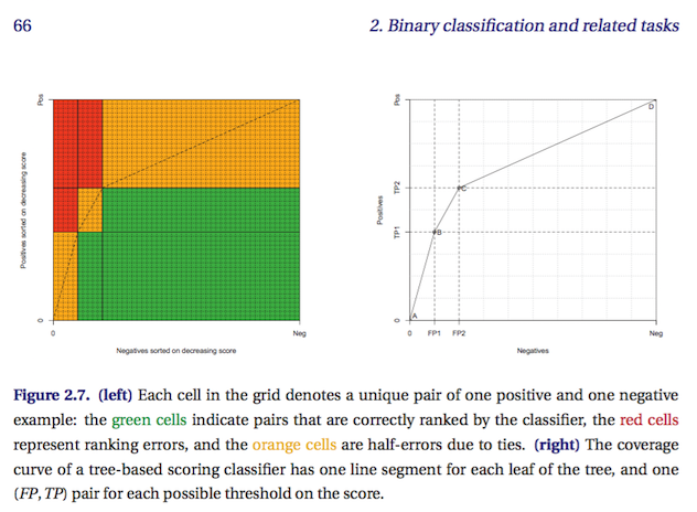
- Flach, P. (2012). Machine Learning: The Art and Science of Algorithms that Make Sense of Data. Cambridge University Press.
The interpretation that each cell is a pair of true and false outcomes and their scores doesn’t always map to reality – usually you have more than 100 pairs and in imbalanced dataset – but in general it helps me imagine model performance and explain to someone what the curve means.